- Load the R package we will use.
- Quiz questions
Replace all the ???s. These are answers on your moodle quiz.
Run all the individual code chunks to make sure the answers in this file correspond with your quiz answers
After you check all your code chunks run then you can knit it. It won’t knit until the ??? are replaced
The quiz assumes that you have watched the videos, downloaded (to your examples folder) and worked through the exercises in exercises_slides-50-61.Rmd
- Pick one of your plots to save as your preview plot. Use the ggsave command at the end of the chunk of the plot that you want to preview.
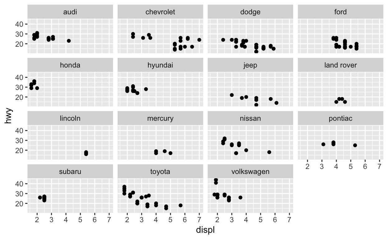
Question: modify slide 51
Create a plot with the
mpgdatasetadd points with
geom_pointassign the variable
displto the x-axisassign the variable
hwyto the y-axisadd
facet_wrapto split the data into panels based on themanufacturer
ggplot(data = mpg) +
  geom_point(aes(x = displ, y = hwy)) +
  facet_wrap(facets = vars(manufacturer))
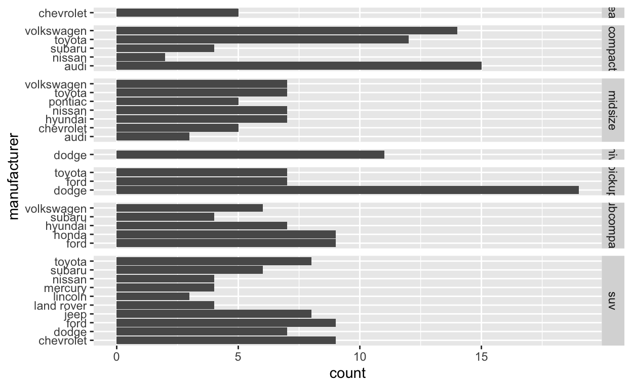
Question: modify facet-ex-2
Create a plot with the
mpgdatasetadd bars with
geom_barassign the variable
manufacturerto the y-axisadd
facet_gridto split the data into the panels based on theclasslet scales vary across columns
let space taken up by panels vary by columns
ggplot(mpg) +
  geom_bar(aes(y = manufacturer)) +
  facet_grid(vars(class), scales = "free_y", space = "free_y")
Question: spend_time
To help you complete this question use:
the patchwork slides and
the vignette: https://patchwork.data-imaginist.com/articles/patchwork.html Download the file
spend_time.csvfrom moodle into directory for this post. Or read it in directly:read_csv(“https://estanny.com/static/week7/drug_cos.csv”)
spend_timecontains 10 years of data on how many hours Americans spend each day on 5 activities
spend_time <- read_csv("spend_time.csv")
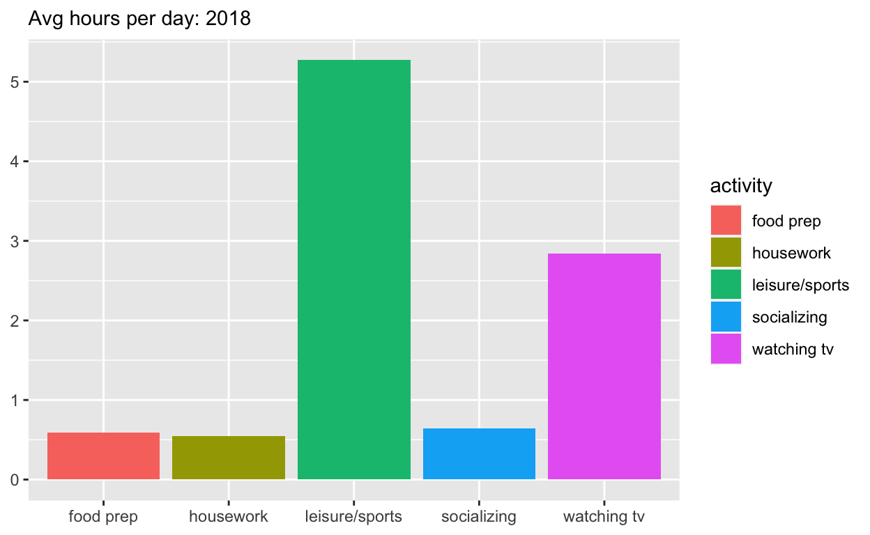
Start with spend_time
extract observations for 2018
THEN create a plot with that data
ADD a barchart with with
geom_colassign
activityto the x-axisassign
avg_hoursto the y-axisassign
activityto fillADD
scale_y_continuouswith breaks every hour from 0 to 6 hoursADD labs to
set subtitle to Avg hours per day: 2018
set x and y to NULL so they won’t be labeled
assign the output to
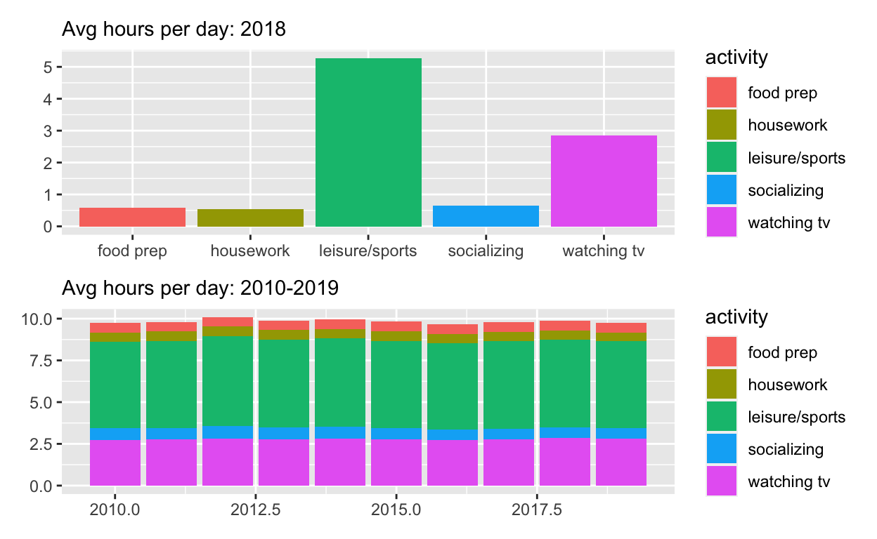
p1display
p1
p1  <- spend_time %>% filter(year == "2018") %>%
ggplot() +
  geom_col(aes(x = activity, y = avg_hours, fill = activity)) +
  scale_y_continuous(breaks = seq(0, 6, by = 1)) +
  labs(subtitle = "Avg hours per day: 2018", x = NULL, y = NULL)

p1
Start with spend_time
THEN create a plot with it
ADD a barchart with
geom_colassign
yearto x-axisassign
avg_hoursto the y-axisassign
activityto fillADD
labstoset subtitle to “Avg hours per day: 2010-2019”
set x and y to NULL so they won’t be labeled
assign the output to
p2display
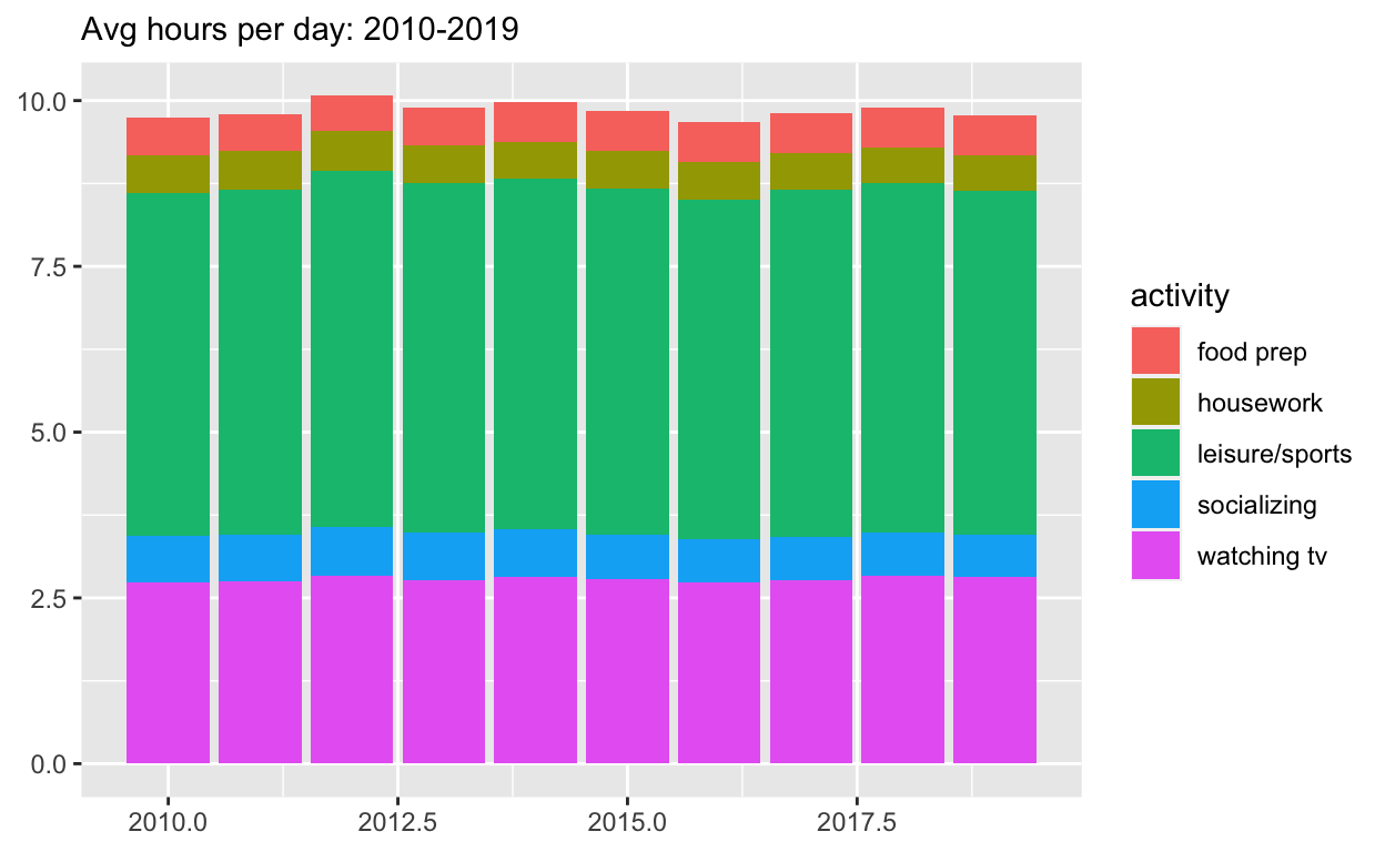
p2
p2  <- spend_time %>%
ggplot() +
  geom_col(aes(x = year, y = avg_hours, fill = activity)) +
  labs(subtitle = "Avg hours per day: 2010-2019",  x = NULL, y = NULL)

p2
Use patchwork to display p1 on top of p2
assign the output to
p_alldisplay
p_all
p_all  <- p1 / p2

p_all
Start with p_all
AND set
legend.positionto ‘none’ to get rid of the legendassign the output to
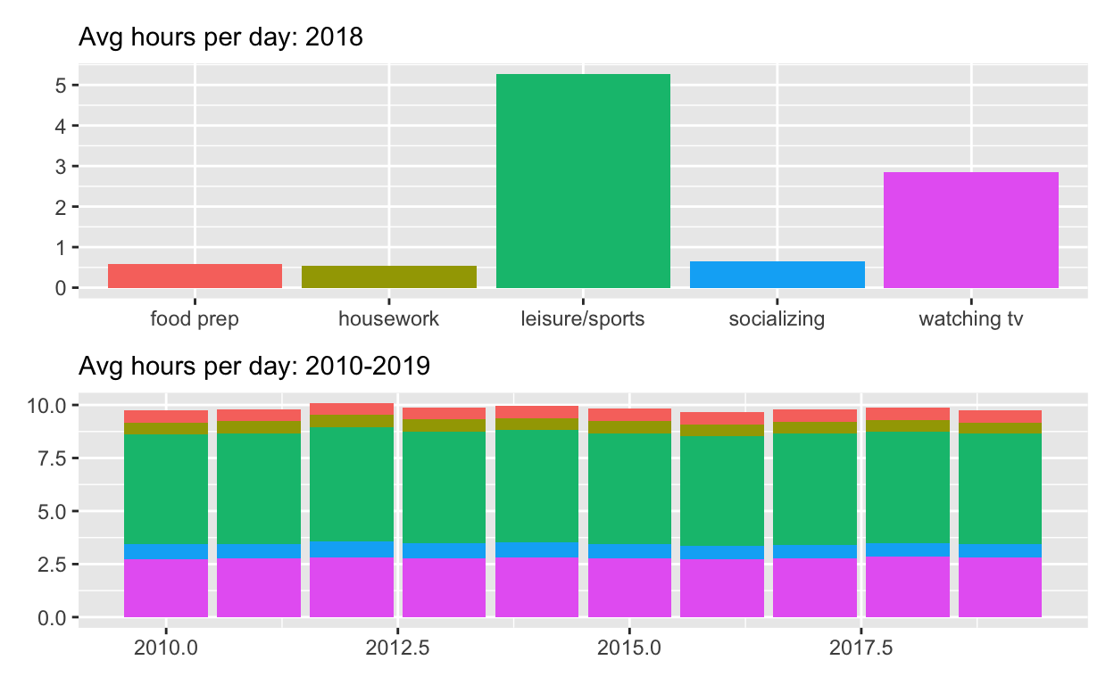
p_all_no_legenddisplay
p_all_no_legend
p_all_no_legend  <- p_all & theme(legend.position = 'none')
p_all_no_legend
Start with p_all_no_legend
see how annotate the composition here: https://patchwork.data-imaginist.com/reference/plot_annotation.html
ADD
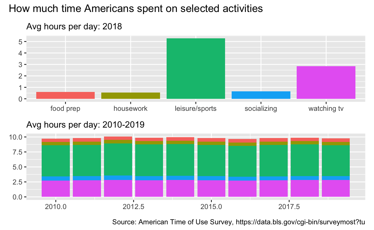
plot_annotationsettitleto “How much time Americans spent on selected activities”captionto “Source: American Time of Use Survey, https://data.bls.gov/cgi-bin/surveymost?tu”
p_all_no_legend  +
 plot_annotation(title = "How much time Americans spent on selected activities",
                  caption = "Source: American Time of Use Survey, https://data.bls.gov/cgi-bin/surveymost?tu")
Question: Patchwork 2
use spend_time from last question patchwork slides
Start with spend_time
- extract observations for housework
-THEN create a plot with that data
-ADD points with geom_point
-assign year to the x-axis
-assign avg_hours to the y-axis
-ADD line with geom_smooth
-assign year to the x-axis
-assign avg_hours to the y-axis
-ADD breaks on for every year on x axis with with scale_x_continuous
-ADD labs to
-set subtitle to Avg hours per day: housework
-set x and y to NULL so x and y axes won’t be labeled
-assign the output to p4
-display p4
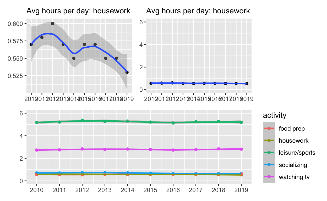
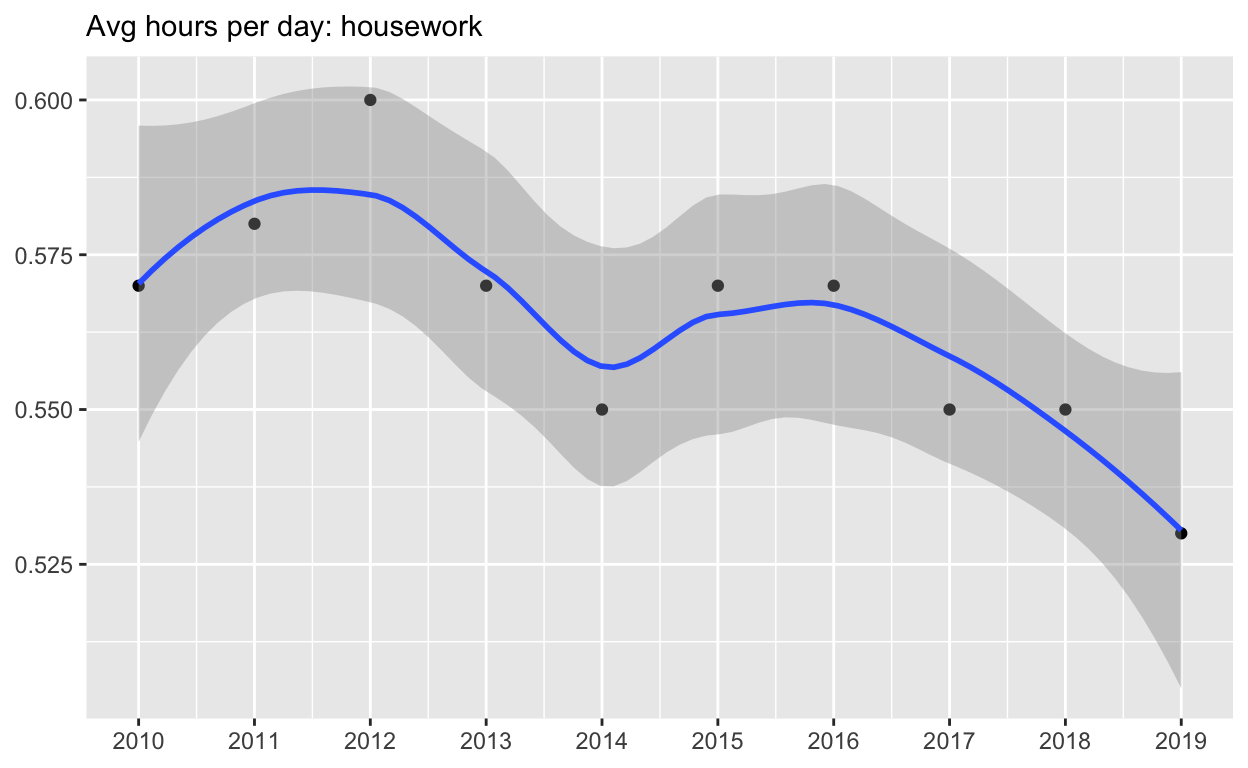
p4  <-
spend_time %>% filter(activity == "housework")  %>%
ggplot() +
  geom_point(aes(x = year, y = avg_hours)) +
  geom_smooth(aes(x = year, y = avg_hours)) +
  scale_x_continuous(breaks = seq(2010, 2019, by = 1)) +
  labs(subtitle = "Avg hours per day: housework", x = NULL, y = NULL)

p4
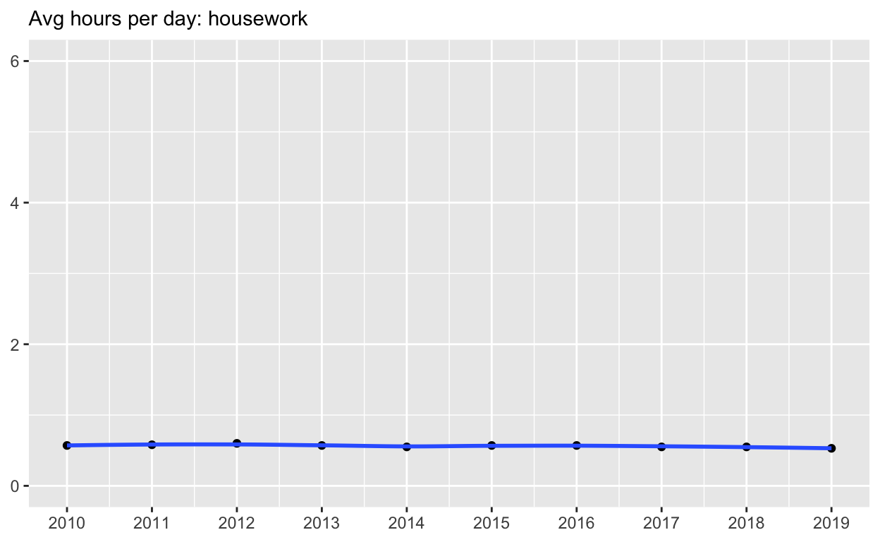
Start with p4
ADD
coord_cartesianto change range on y axis to 0 to 6assign the output to
p5display p5
p5 <-  p4 + coord_cartesian(ylim = c(0, 6))
p5
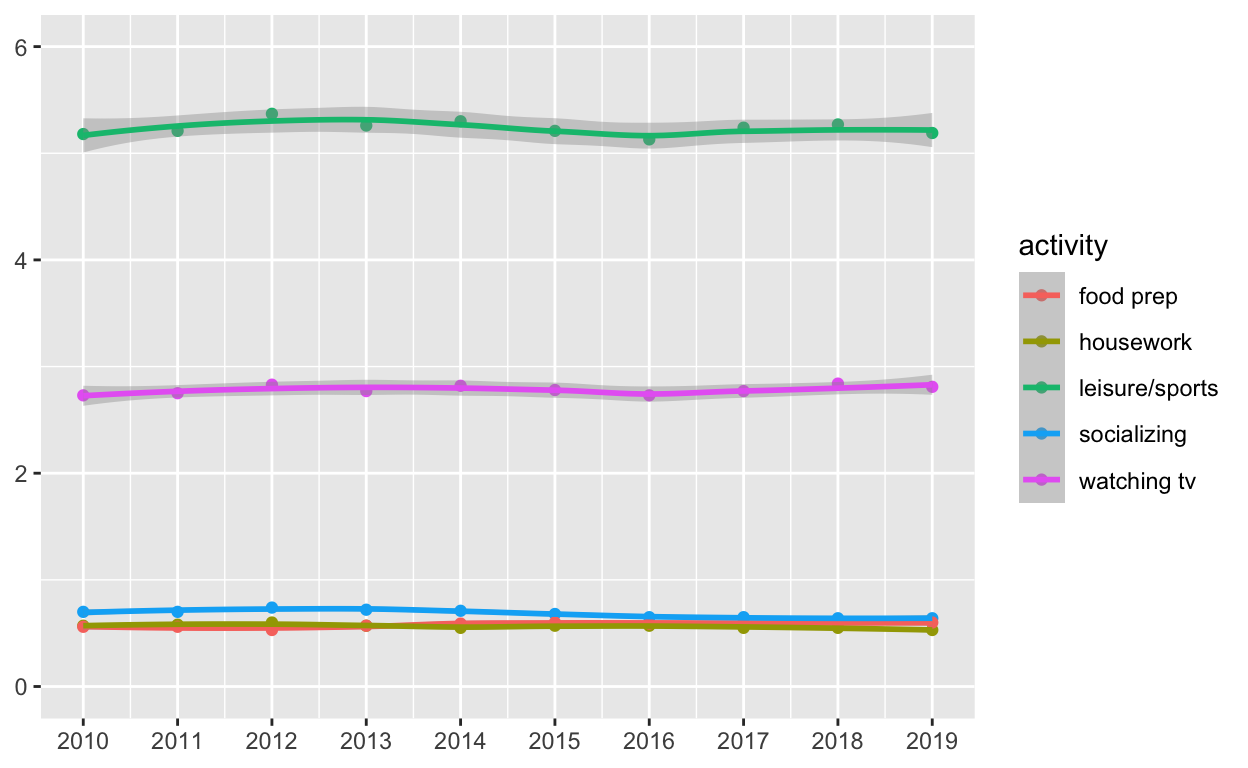
Start with spend_time
create a plot with that data
ADD points with
geom_pointassign
yearto the x-axisassign
avg_hoursto the y-axisassign
activityto colorassign
activityto groupADD line with
geom_smoothassign
yearto the x-axisassign
avg_hoursto the y-axisassign
activityto colorassign
activityto groupADD breaks on for every year on x axis with with
scale_x_continuousADD
coord_cartesianto change range on y axis to 0 to 6ADD
labstoset
xandyto NULL so they won’t be labeledassign the output to
p6display
p6
p6   <-
 spend_time  %>%
ggplot() +
  geom_point(aes(x = year, y = avg_hours, color = activity, group = activity)) +
  geom_smooth(aes(x = year, y = avg_hours, color = activity, group = activity)) +
  scale_x_continuous(breaks = seq(2010, 2019, by = 1)) +
  coord_cartesian(ylim = c(0, 6)) +
  labs(x = NULL, y = NULL)

p6
Use patchwork to display p4 and p5 on top of p6
( p4 | p5 ) / p6